|
risk/cntry ... |
... scaled | |||
| total | select. | total | select. | |
| RT | ||||
| IAEA | ||||
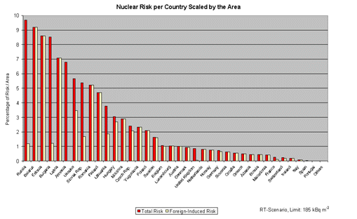
This diagram shows the risk scaled by country area as shared by single
countries. Red columns represent the risk (per country area) of all NPPs while yellow
columns represent the share of the risk (per country area) which is due to NPPs outside the
country. Countries in Eastern Europe receive the bulk of the risk while
countries such as Portugal, Ireland and the mediterranean countries
range at the safe end. Among the non-nuclear countries, Luxembourg,
Denmark and Austria are exposed to the highest risk.