|
risk/cntry ... |
... scaled | |||
| total | select. | total | select. | |
| RT | ||||
| IAEA | ||||
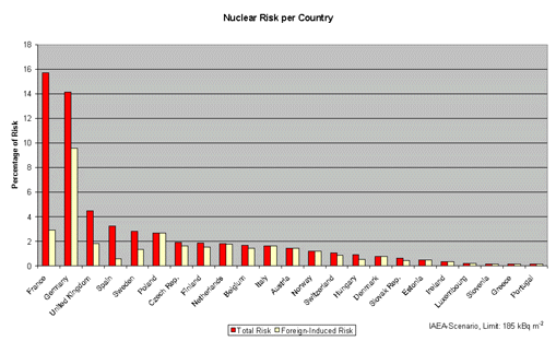
This diagram shows the risk shared by single
countries. Red columns represent the risk of all NPPs while yellow
columns represent the share of the risk which is due to NPPs outside the
country.