|
risk/cntry ... |
... scaled | |||
| total | select. | total | select. | |
| RT | ||||
| IAEA | ||||
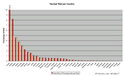
This diagram shows the risk shared by single countries.
Red columns represent the risk of all NPPs while yellow columns represent
the share of the risk which is due to NPPs outside the country. Russia
is by far exposed to the highest risk (66%), but only 8% stems from non-Russian
NPPs.