| RT scenario | total | select. |
| risk/cntry | ||
| r./c. scaled | ||
| risk red. |
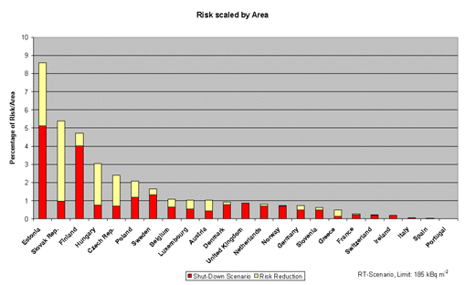
This diagram shows the risk reduction (risk per country area) after the shut-down of 13 blocks. The total height of the columns shows the original risk (per country area) for the respective countries in % of the total European risk. The red part represents the risk that remains after the shut-down (per country area) and the yellow part represents the risk reduction (per country area).